Hi,
If you have more than one data sets to be plotted on the graph, you can easily do that in excel under the 'insert' scatter option. Follow the given eight steps with images.
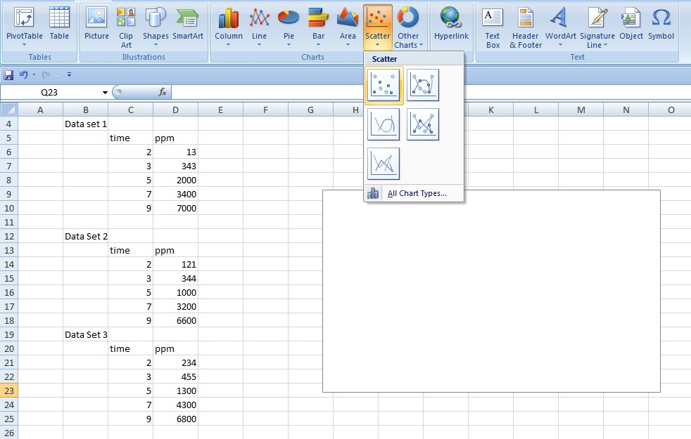
Step.1 Make three data sets separately, and choose 'scatter' graph under 'insert' menu.
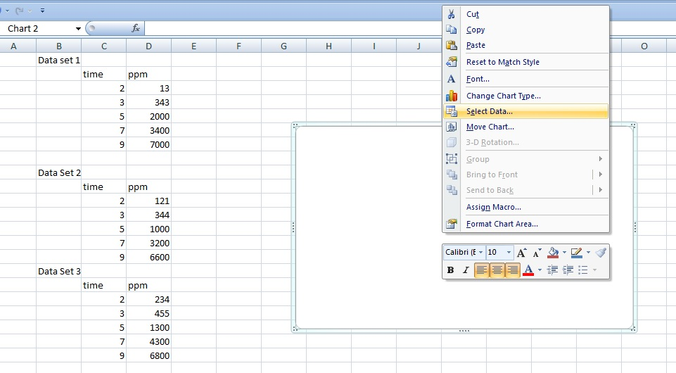
Step.2 Right click on the scatter graph, and select 'select data'
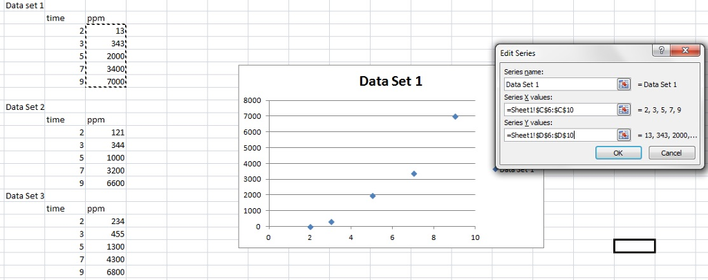
Step.3 Click on add and a small box will pop up. Give any series name, say 'Data Set 1', select all cells containing x -axis and y-axis values for the corresponding given boxes.Once you click 'ok' those blue data dots will appear on the scatter.
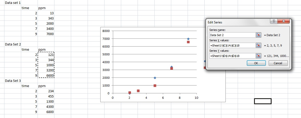
Step. 4 Now again click 'add' in the select data option, and then give another series name, say 'data set 2' and choose the corresponding data from data set 2 on the cells. Once done, those maroon colored dots will appear corresponding to 2nd data set.
Step. 5 Repeat step.4 for data set 3, and those light green dots will appear.
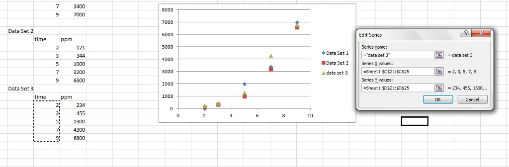 your 'select' data box will have now three series of data, and you can edit them or remove them, or you can even add another data set, by clicking on 'add'
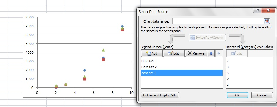
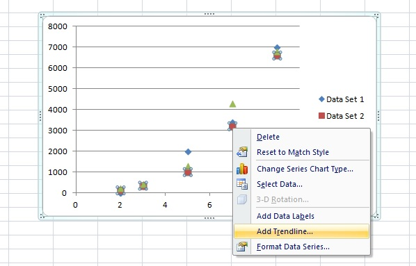
Step.7 You can add trendlines to make it more appealing.
click on the series for which you want to add trendlines, once dots get selected, give a righ click, and this add trendline option will appear.
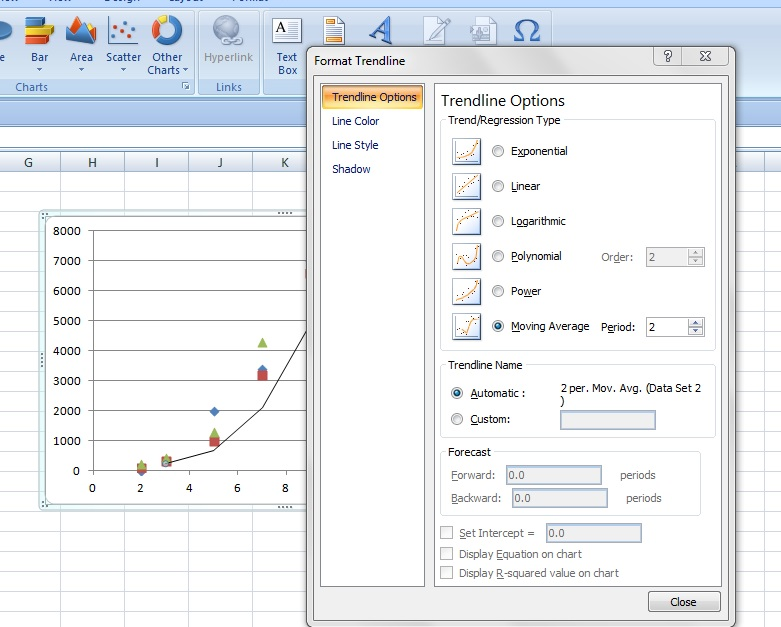
select among various options, how you want it to appear, linear, polynomial, etc. are various options, here I am selecting 'moving average.'
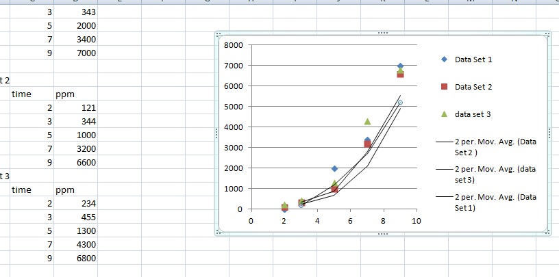
If you do same for all three series, this is how the final graph look like.
Thank you for vising!
Take care!


